
Shaw Sells DC
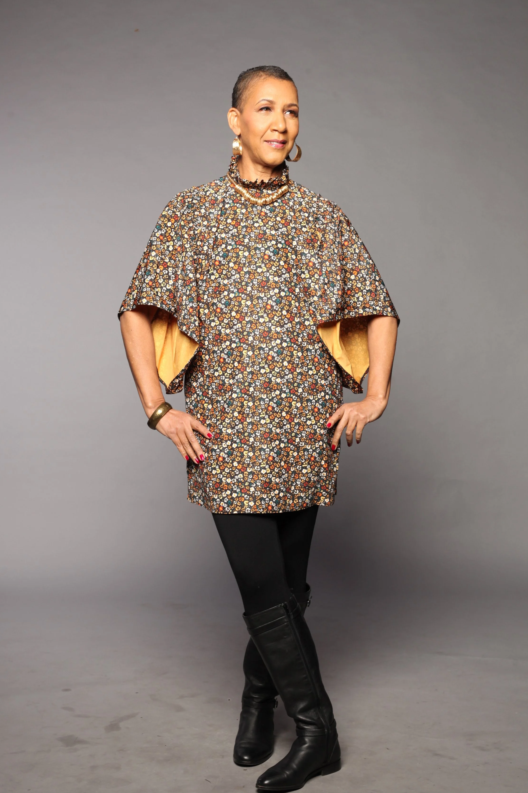
Cheryl Shaw is a DC-based real estate advisor known for her community-focused approach and strong cultural ties.
Cheryl needed a clear personal brand that reflected her values and supported growth beyond the DC market.
The goal was to create a visual identity that connected art, culture, and community while remaining flexible across new regions.
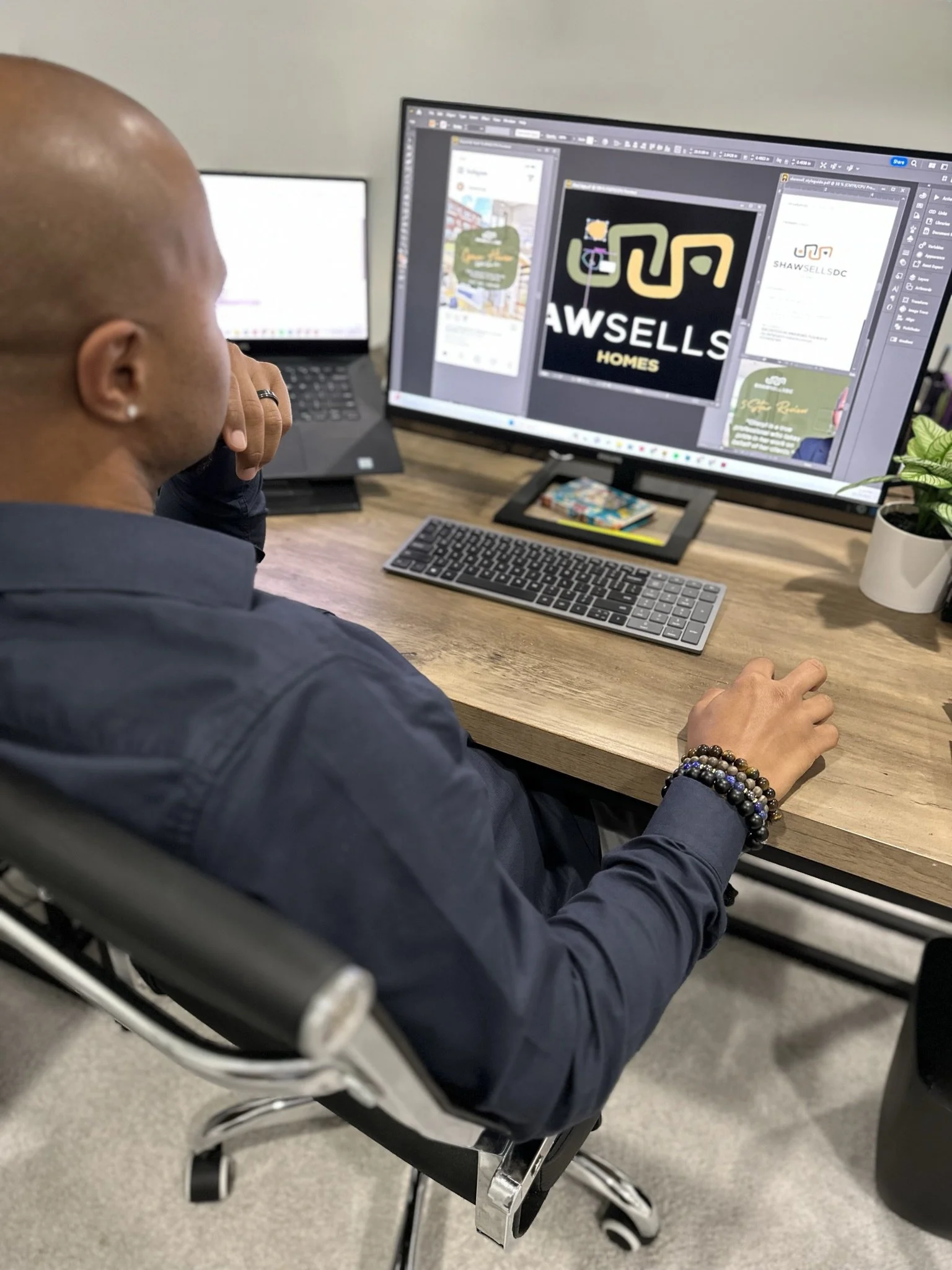
I designed a logo, built a Canva-based brand kit, and created social media graphics, branded giveaways, and web ads for consistent multi-channel use.
The refreshed brand supported expanded visibility and confidence, contributing to $12M in annual sales across DC, Maryland, and Virginia.
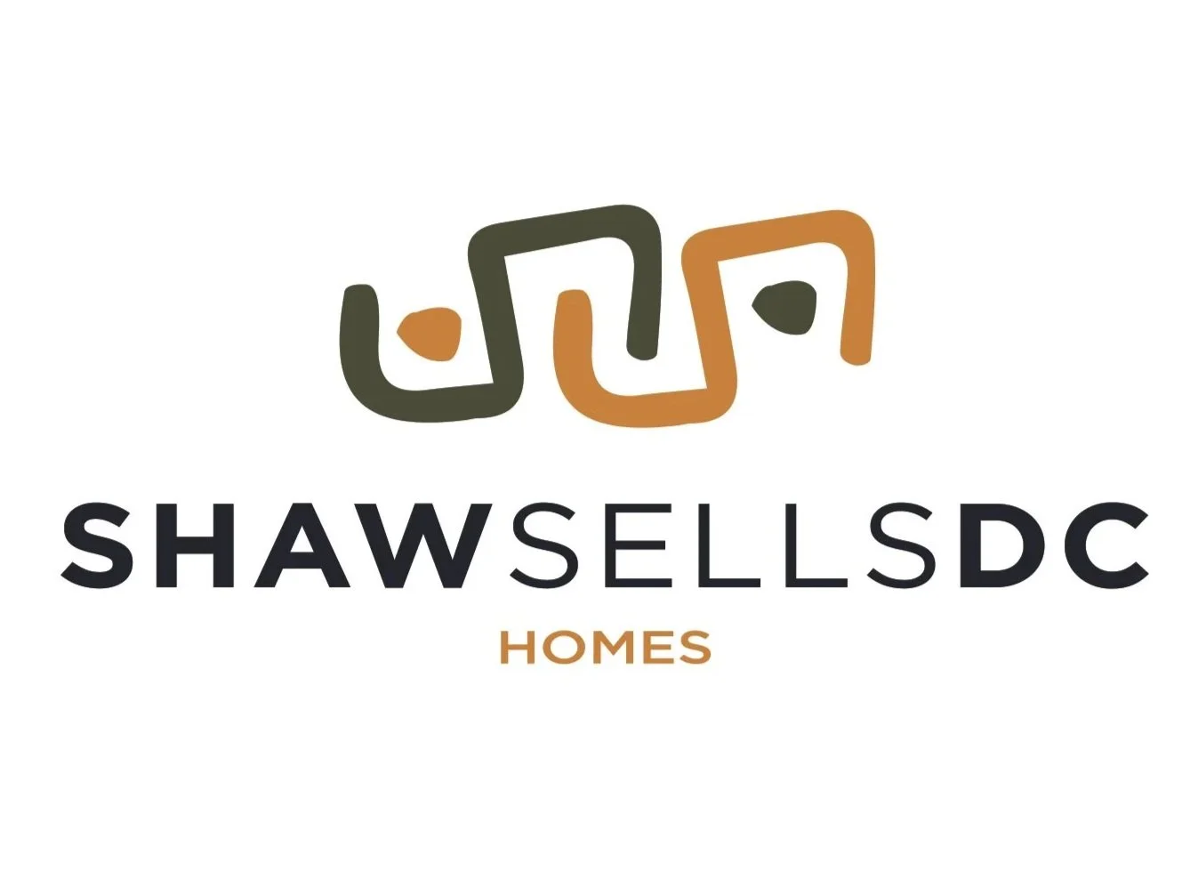


Logo Design
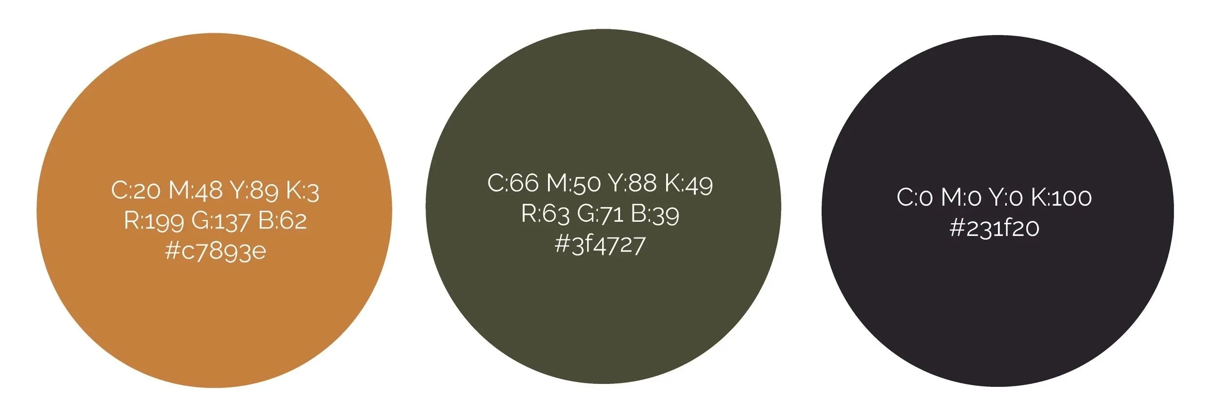
The logo was designed to reflect Cheryl’s connection to art, culture, and community while remaining clean, professional, and adaptable across markets. A modern, confident typeface and a warm, grounded color palette were chosen to ensure clarity, flexibility, and consistent use across digital and print applications.


Social Media
The social media graphics were designed to be original, artistic, and functional, incorporating the logo’s organic curves, the signature green and gold palette, and hand-written header fonts to create a personal, approachable presence.